As part of a remodel and flip of a Massachusetts bungalow, interior designer Karen Goodman gave a blue 1960s bathroom a simple, sophisticated update that not only looks more era-appropriate but also makes the 60-square-foot-bathroom feel lighter and larger. After the redo, it took only a day for the house — more than a century old — to be sold. Room of the Day: Tiny Powder Room With a Treehouse Feel
Room at a Glance: Bathroom Location: Worcester, Massachusetts Size: 60 square feet (5.5 square meters) “I wanted to save this house,” Goodman says. “Whenever I find an old house that needs updating, I look at it like a lost puppy.” By the time Goodman sold the historic home in April, she had spent almost a year renovating it. She blogged about the project, from reconfiguring to rewiring. This was Goodman’s fourth flip but her first of a historic home. Though she lives in a 100-year-old home herself, she says this project tested her. “I learned my limits with this project,” she says. Whereas other flips might have required extensive woodwork replacement in one room, or some re-tiling, this house needed that in every room. “It took a lot more time and energy than I thought it would be and was worth it in the end,” she says.
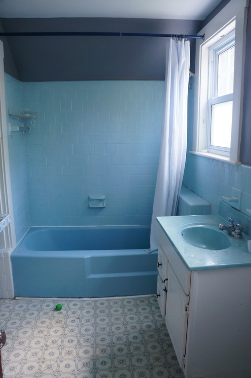
BEFORE: Major renovations had been done in the 1960s, and it was apparent that the home’s only bathroom hadn’t really been touched since. “A blue ’60s bathroom just doesn’t quite fit in a 1900s house,” Goodman says. Additionally, all of the plumbing was corroded and needed to be replaced, and the bathroom ended up being a complete gut. The home is more than a hundred years old, with some records dating it back to 1902. Goodman wanted to honor the home’s heritage but didn’t feel tied to making everything authentic. “It was a very different way of living back then. Just because it worked for someone 100 years ago doesn’t mean it will work for you now,” she says. Since she was redesigning the home to sell, and not for a particular client, she made sure to make design choices that had wider appeal. Goodman consulted with a trusted real estate agent during the renovation about some of her design decisions. The agent offered feedback on some of the features based on her experience about what typically helps or hurts a home’s selling potential.
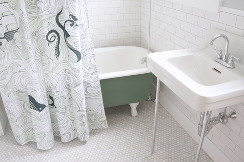
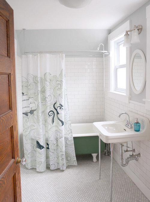
AFTER: The home’s age and the bathroom’s size influenced her decision to use a freestanding bathtub and wall-hung sink. “I did get some eyebrows raised when I said I was going to install a clawfoot tub and wall-hung sink,” she says, especially as the four-bedroom home has only bathroom, but it was a decision she knew was right for this bathroom. “I like to put in something a little polarizing,” she says. Someone is going to love it or hate it, but it will set it apart from other things on the market. The tub, which she painted army green, came from Habitat for Humanity’s ReStore. Overall the tub was in great shape, particularly the interior porcelain, and needed only exterior sanding and a fresh coat of paint. ”I like to add a little color, but strategically,” she says. “If you do everything neutral, people aren’t going to remember the house. You gotta give them something to fall in love with.” Because the tub is a little bolder, she played down the rest of the bathroom with grays and whites. But Goodman wasn’t thinking only about making a design statement. “Things on the floor stop your eye,” she says. By lifting everything off the floor, even a couple of inches, the bathroom feels larger. The claw-foot tub and the wall-mount sink allow you to see the floor continue, which helps you visualize a larger space.
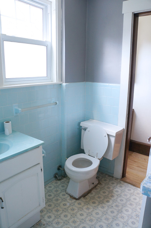
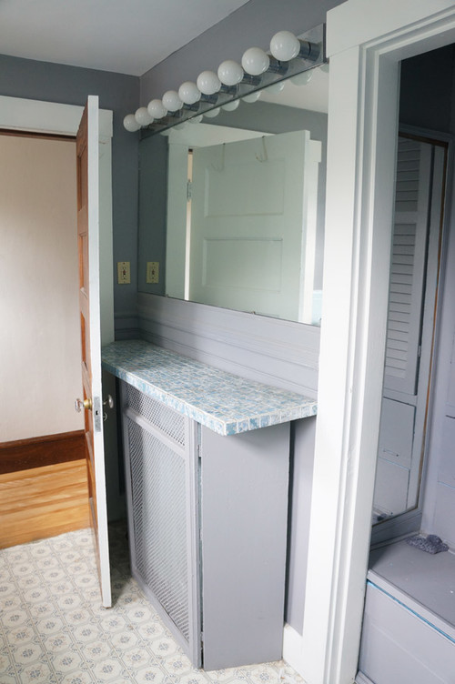
BEFORE: The previous toilet butted up right next to the vanity, and Goodman says people’s knees could hit the vanity when they used it. Though the cabinet did have valuable storage space, it made the room cramped and didn’t feel authentic to the house.
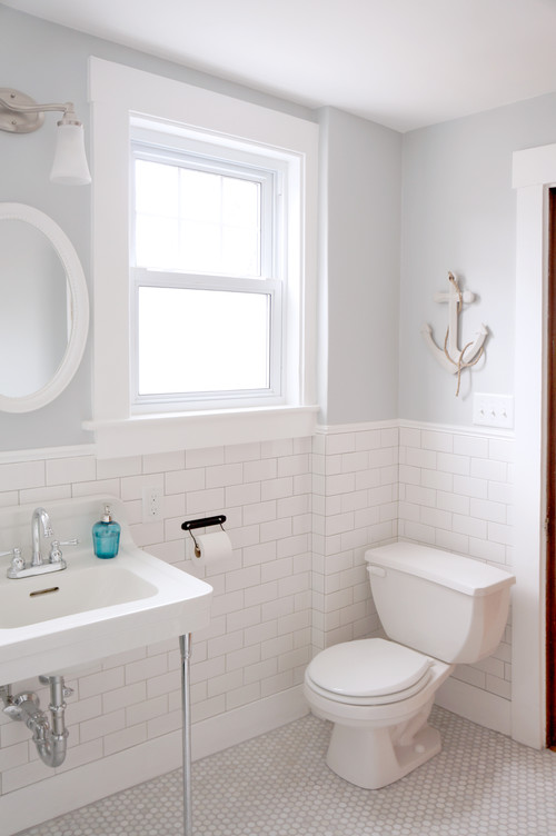
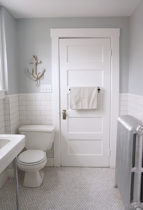
AFTER: The new washstand sink opens up this corner of the bathroom. Goodman salvaged the sink from a nearby bungalow of a similar age that was also being remodeled. Once she started demolishing the bathroom, she could see that the original sink had been wall hung, like this one. “It was nice to bring it back to what it had been 100 years ago,” Goodman says. The toilet is new. One day while driving, Goodman passed another home that was being remodeled and saw a toilet out front with a sign that read “Free, never used.” That toilet is now in this bathroom.
BEFORE: The bathroom’s original radiator was enclosed in an ill-fitting wood cabinet with a tile countertop.
AFTER: Goodman removed the cabinet and saw that the radiator was in great shape — no rust or cracks and in working condition — so she painted it silver and left it exposed. “I’d much rather see the radiator than a random box on the wall,” she says. The bathroom’s neutral walls and floors reflect the home’s era while still feeling fresh and updated. Goodman installed the bathroom’s marble mosaic floor herself — it was a material she’d been wanting to use in one of her projects for a while — and painted the walls with recycled paint. “The designer in me likes to use my flips as experimentations,” she says. Her contractor installed the white subway tile wall.
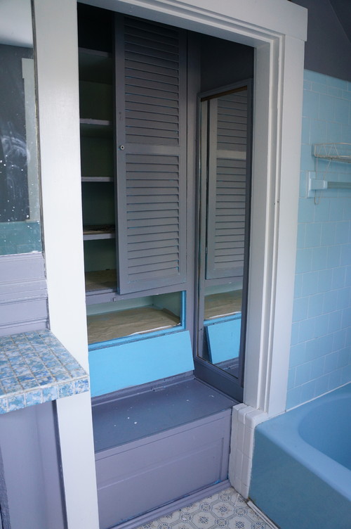
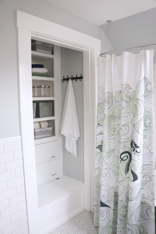
BEFORE: Most of the shelves in the built-in closet are original, but the louver doors had been added at some point and didn’t fit very well. Overall it was a convenient storage space, and Goodman wanted to make as much use of it as possible. She kept to a strict rule when it came to painting the wood in the house: “If it’s painted, it’s getting painted. If it’s wood, it’s staying wood,” she says. “It wasn’t my place to decide what should be wood and what shouldn’t be in a place I don’t plan to call home.”
AFTER: The new washstand sink eliminated a lot of the bathroom’s storage, so Goodman made the existing closet as functional as possible. She kept the original shelves but removed the ill-fitting cabinet doors and added new trim. She rebuilt the bench with a lift-up top to store bath toys or other oversized bathroom accessories. Concealed drawers can store toilet paper and other supplies, and the open shelves can hold toiletries and linens. Though the new storage is a little farther away from the sink, it’s more attractive and opens up the space. "It might not be as convenient, but you’ll feel a lot less cramped with the extra space," she says.
The post was written by Annie Thornton, Houzz and posted by RealBird with permission.

Leave a Reply
You must be logged in to post a comment.